
Step 3 of 13 in From idea to a production-ready tech pack
Design and development page
The Design & Development page will be used for Design until the Style is developed.
Under review. This page is published while we check it against the live app, so some details may have changed.
Collection & StylesStyles(select a style)Design & Development
Permission: VIEW_DESIGN_DEVELOPMENT,VIEW_TYPE_VERSION
The Design & Development page will be used for Design until the Style is developed. The Design & Development page has six stages of the Design & Development.
- Users need to upload Design & Development files.
- Users can add annotations and comments in your workspace.
- Users can download the Attachment File from Design & Development of the Style using the Download Function.
- Submit button: Users can move the Design & Development to the next stage. Click "Submit" on the top right-hand side of the Design & Development main page.
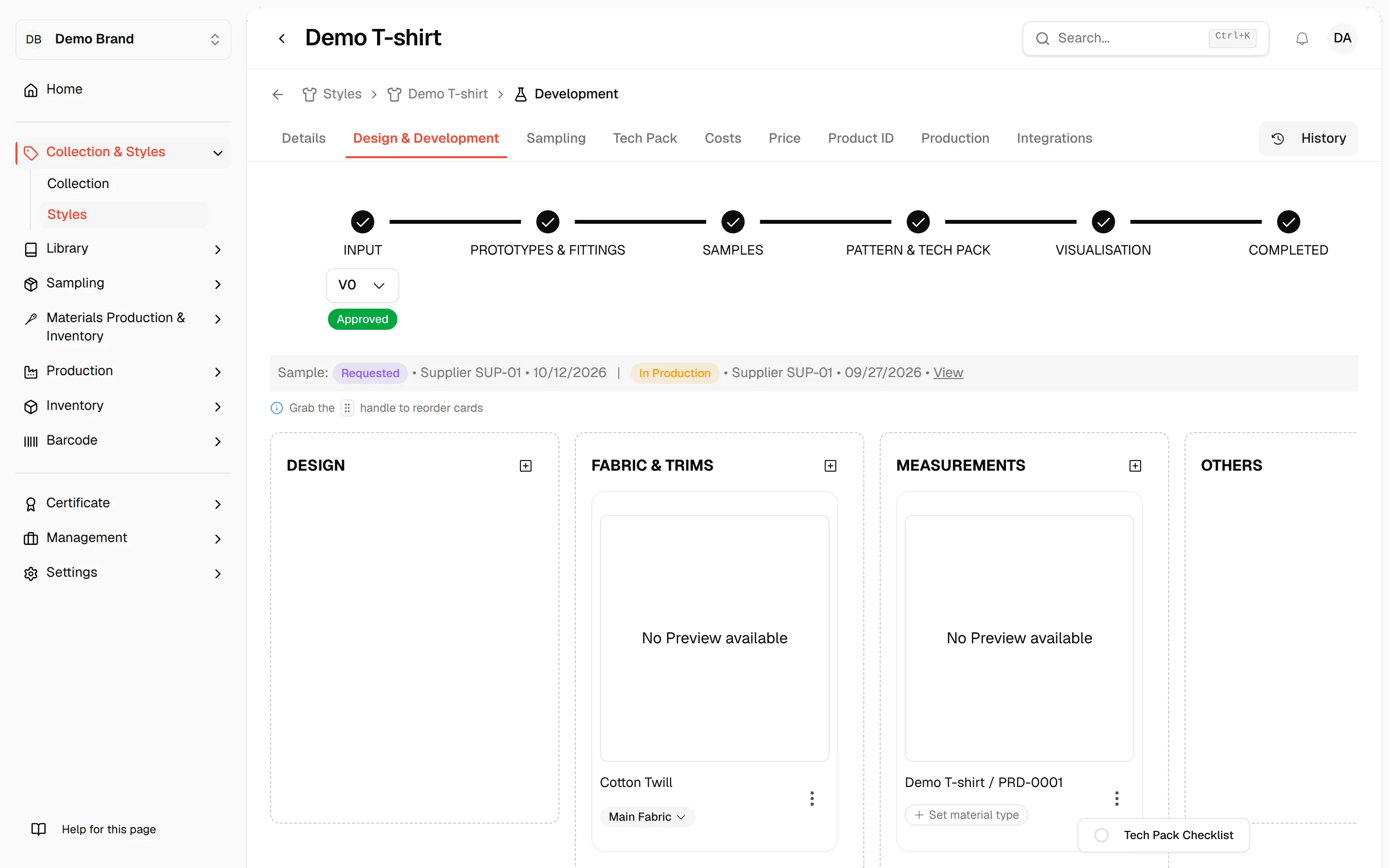
Other users who have permission (Usually Brand Admin) will be displayed by the button; then they can use the "Request Changes" and "Approve" buttons.
Once a style has been submitted and approved…
Once a style has been submitted and approved by the other team, we will start the development and upload the deliverables based on Vestis Labs’s approval process workflow to review, approve, and reject deliverables/results.
Users can Complete a Design & Development on Pattern & Tech Pack or Visualisation Stage.
Step 7
History: All the actions on Design & Development will be recorded on the History in the upper right corner.
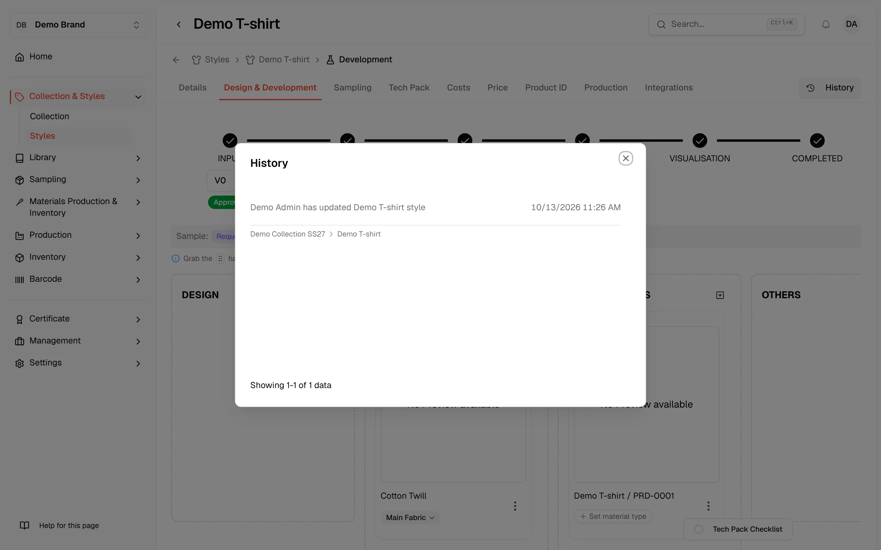
Tech pack Checklist: Select the tech pack list…
Tech pack Checklist: Select the tech pack list on the lower right corner of the design & development page. These features will help users organize and avoid the missing steps in creating the tech pack.
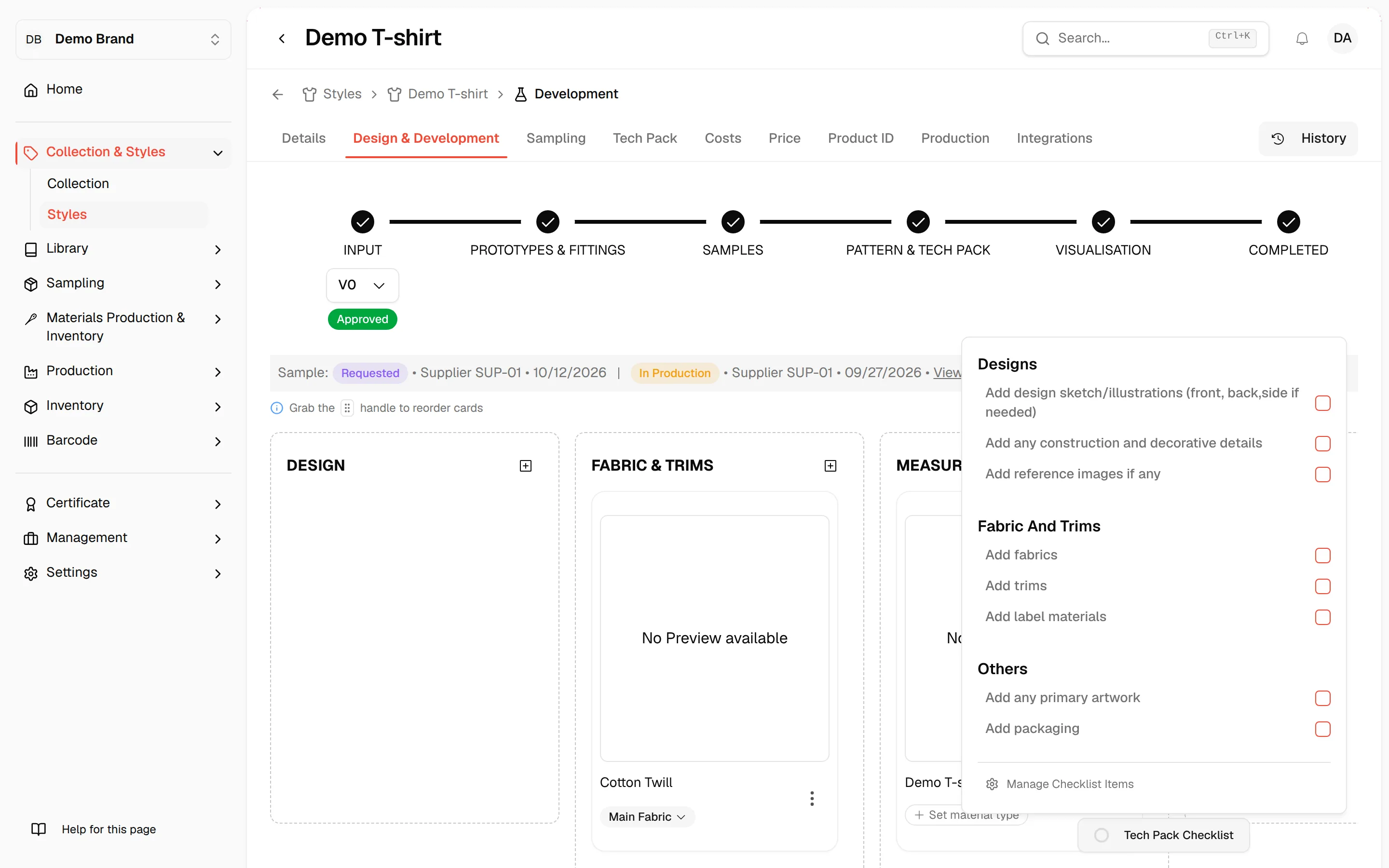
Items are added in settings, not in this popover: click Manage Checklist Items at the bottom of the popover to open Tech pack checklist settings. Items are grouped by category.
If users have completed the checklist, they can tick the task to mark it as done.