Step 4 of 13 in From idea to a production-ready tech pack
Design and development stages
Design & Development page will display 6 stages of the Design & Development , there are:
Under review. This page is published while we check it against the live app, so some details may have changed.
Screenshots may be out of date.
- Input
- Prototypes & Fittings
- Samples
- Pattern & Tech Pack
- Visualisation
- Completed
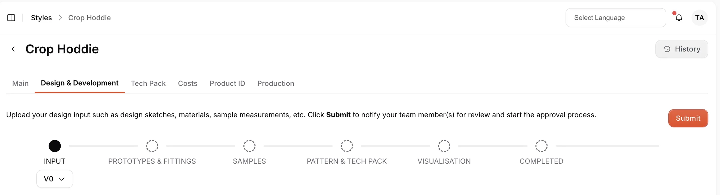
Collection & StylesStyles(open a style)Design & Development
Permission: VIEW_DESIGN_DEVELOPMENT,VIEW_TYPE_VERSION
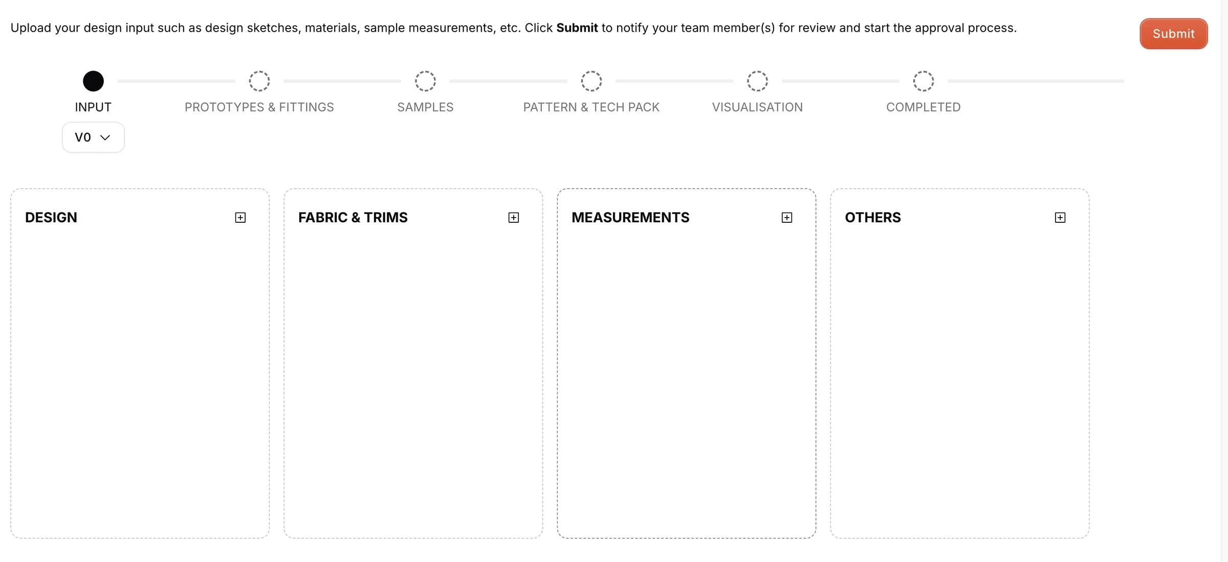
the Input stage, there are 4 sections users can upload regarding the Style, there are:
- Design: will be used for uploading the Design of the Style
- Fabric & Trims: will be used for uploading the material of the Style
- Measurements: will be used for uploading the measurements of the Style
- Others: will be used for uploading other's input (usually Packaging or Label)
Note
The Input stage also has a Notes column for free-text notes about the style.
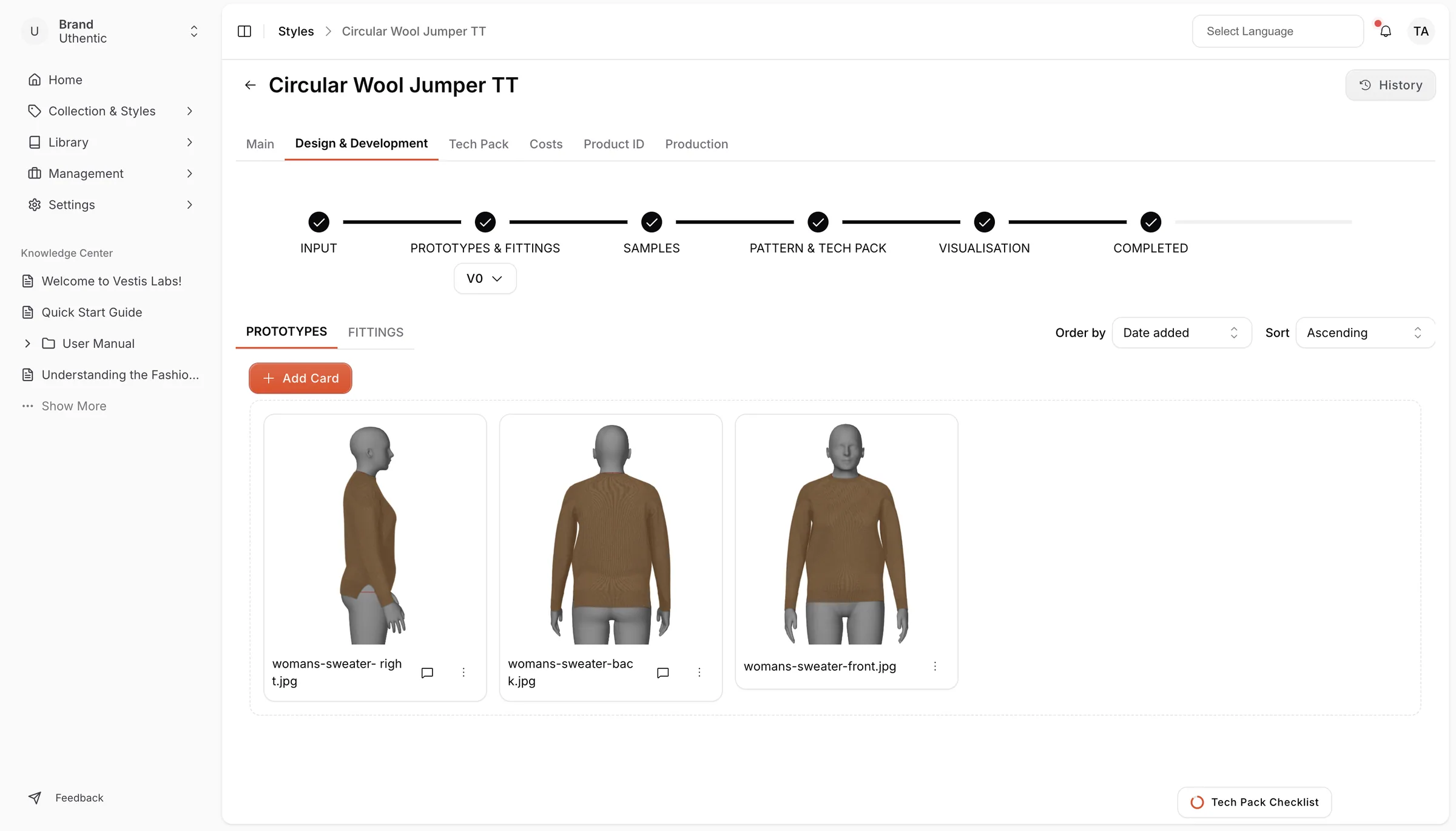
the Prototypes & Fittings stage, there are 2 sections users can upload regarding the Style, there are:
- Prototypes: will be used for the Prototype of the Style.
- Fittings: will be used for the Fitting of the Style.
Samples stage, there is only 1 section, which is
- Samples: it will be used for the Samples of the Style
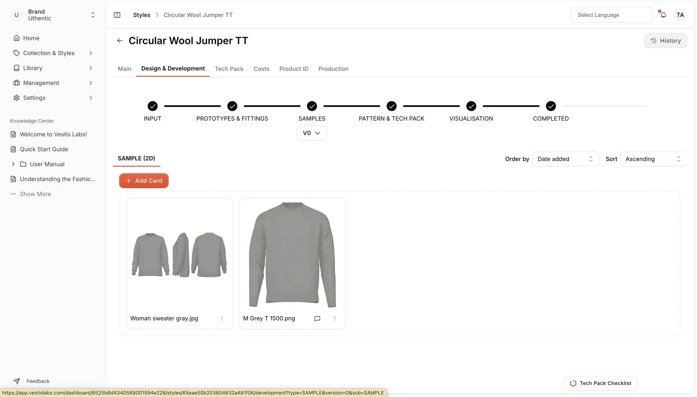
the Pattern & Tech Pack stage, there 2 sections:
- Pattern: will be used for the Pattern of the Style
- Tech Pack: will be used for the Tech Pack of the Style
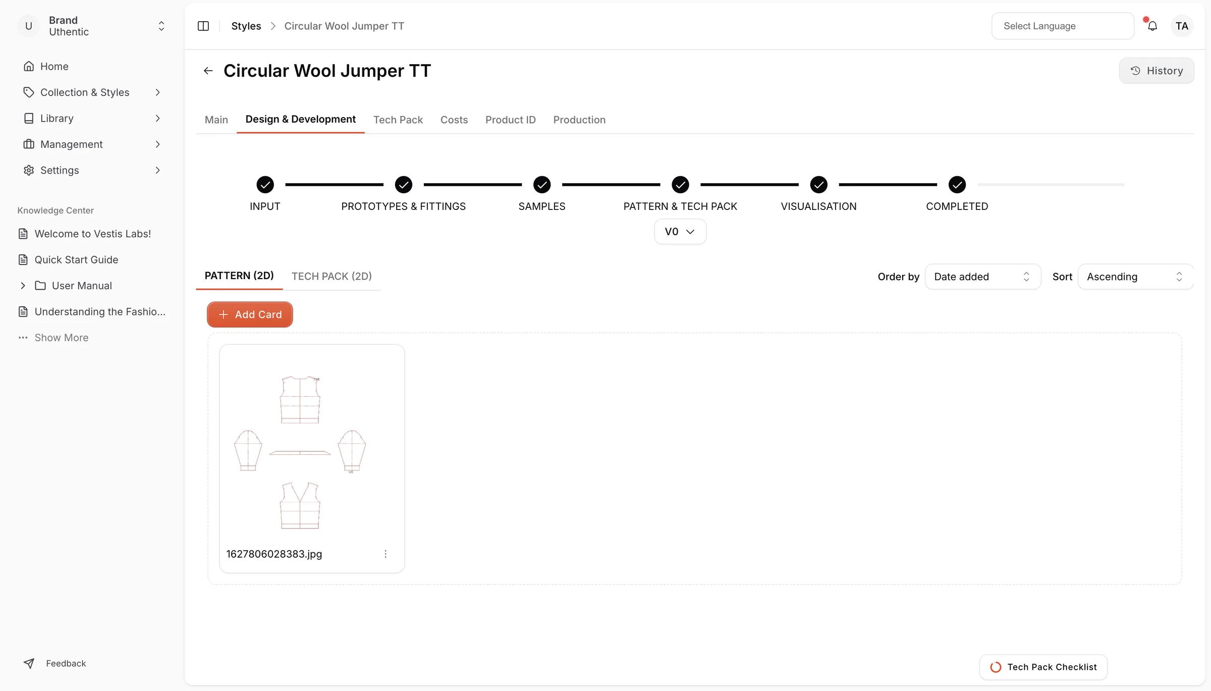
Visualisation, there is only 1 section, that is
- Visualisation: it will be used for the Visualisation of the Style
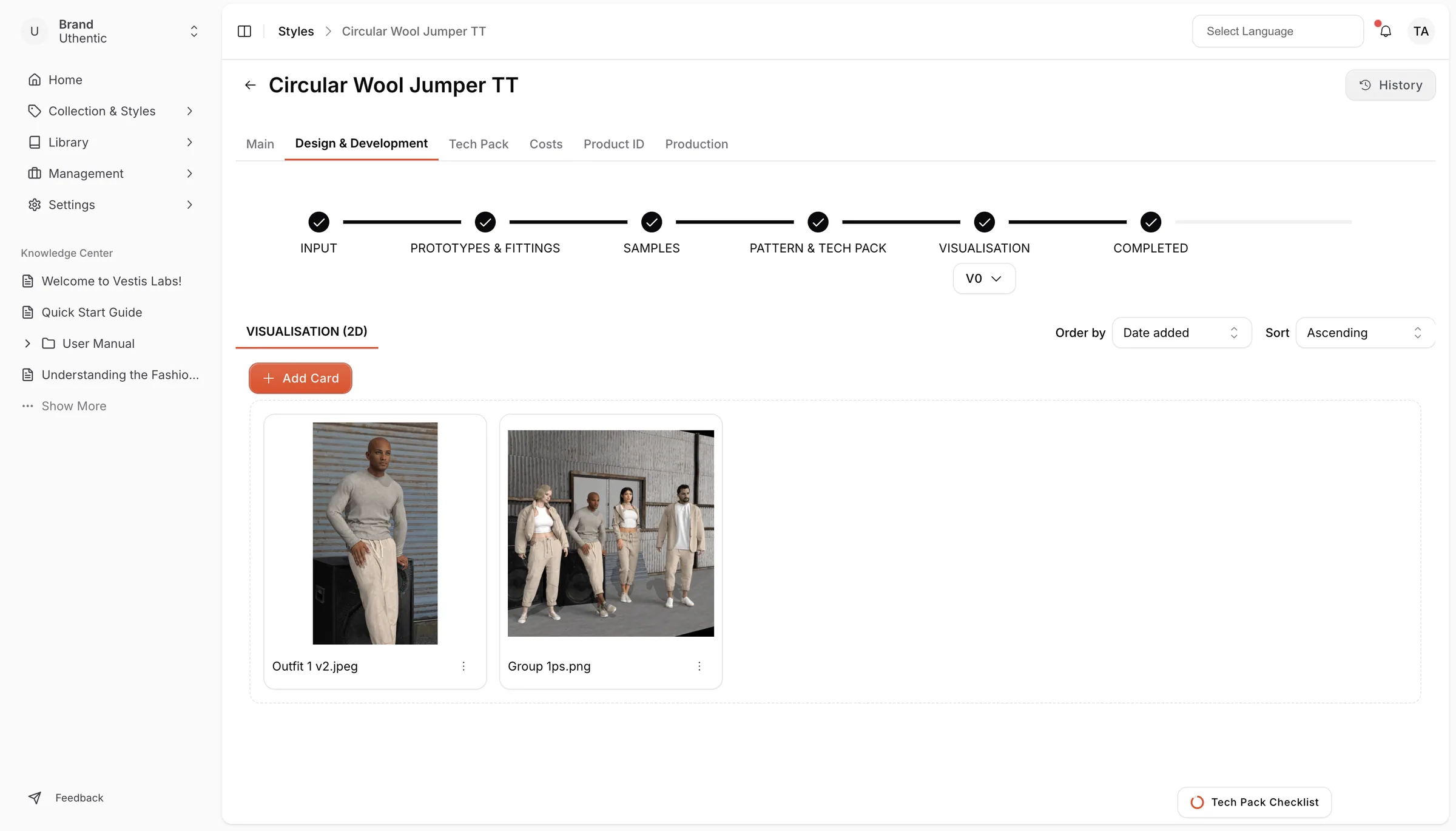
Click the three-dot menu on the card to open the action menu.
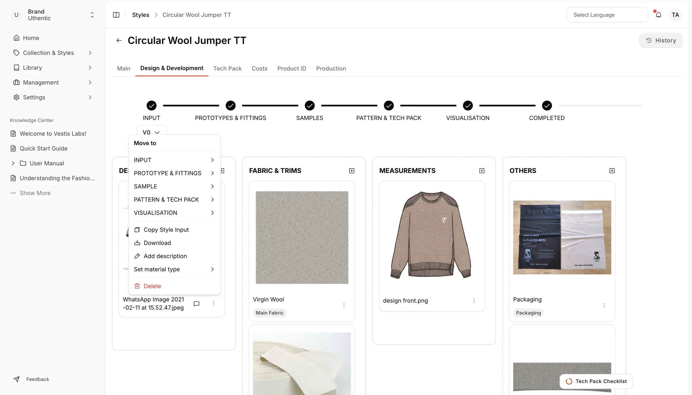
The following actions are available:
- Go To Library – Open the linked library item.
- Move to – Move the item to another workflow stage.
- Lock – Prevent further modifications.
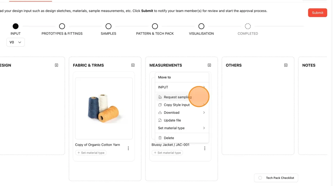
- Request sampling – Create a sampling request.
- Copy Style Input – Duplicate the style input.
- Download – Export or download the file in PDF or Excel.
- Add description – Add notes or descriptions.
- Update file – Replace or update the uploaded file.
- Set material type – Assign a material category.
- Delete – Remove the item from the section.
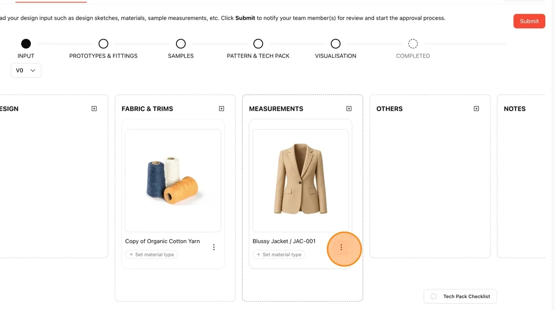
In a measurement card, and in a card linked to a library item, users can Request sampling when the Sampling feature is turned on for your brand. The measurement card asks for colours and sizes.
Click the three-dot menu on the card.
Select Request sampling from the dropdown menu.
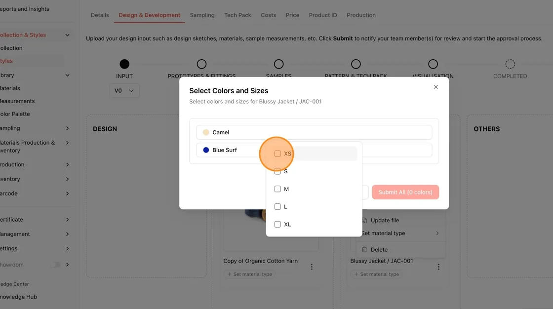
In the Select Colors and Sizes popup:
- Choose the required color.
- Select one or multiple sizes such as XS, S, M, L, or XL.
After selecting the required sizes, click the Submit All button.
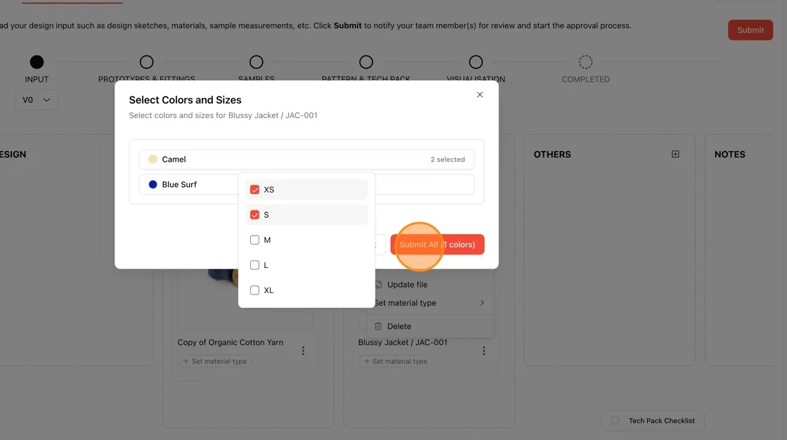
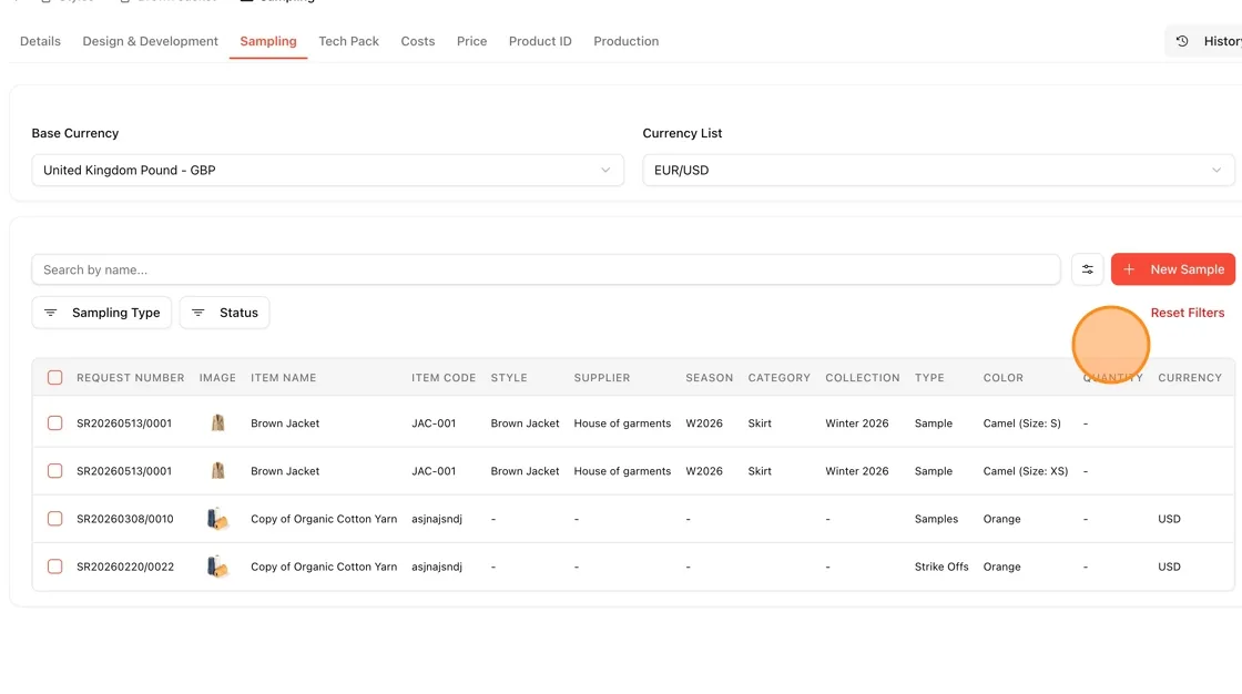
The sampling requests will be created and displayed in the Sampling section.