
Search & filter - admin setup
This article explains the different Quick Search settings you can configure in Admin for searching styles and how to use filtering tools within the Admin section of Vestis Labs to help you…
Under review. This page is published while we check it against the live app, so some details may have changed.
Screenshots may be out of date.
This article explains the different Quick Search settings you can configure in Admin for searching styles and how to use filtering tools within the Admin section of Vestis Labs to help you navigate and manage your data efficiently.
Quick search settings
Quick Search Settings allow users to define fast and efficient search rules for styles or items across Vestis Labs. By configuring how search terms behave, such as prioritising style codes, names, or tags. Users can quickly locate the information they need.
In the quick search, you can specify how the system searches for styles and items.
- Type the item codes or names.

Style filter settings
Style Filter Settings enable admins to configure default filtering options available when users browse or manage styles. By defining which attributes can be filtered such as season, brand, status, or category.
Navigate to: Collection & Style > Style
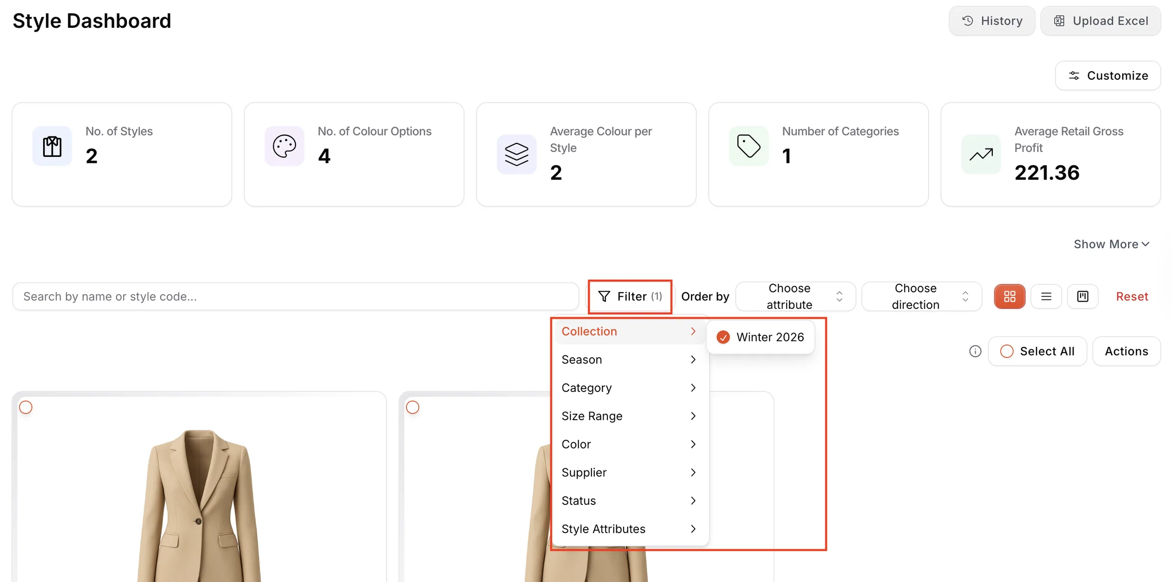
- Find the headline 'Filter.'
- Select the filter categorization from the dropdown menu.
- Set a checkmark to select the subcategory of the filter.
Order by the style / collection
This option allows you to sort your list based on the creation date of styles or collections. It helps you quickly identify the newest or earliest entries, making it easier to track recent additions or review older records.
Navigate to: Collection & Style > Style
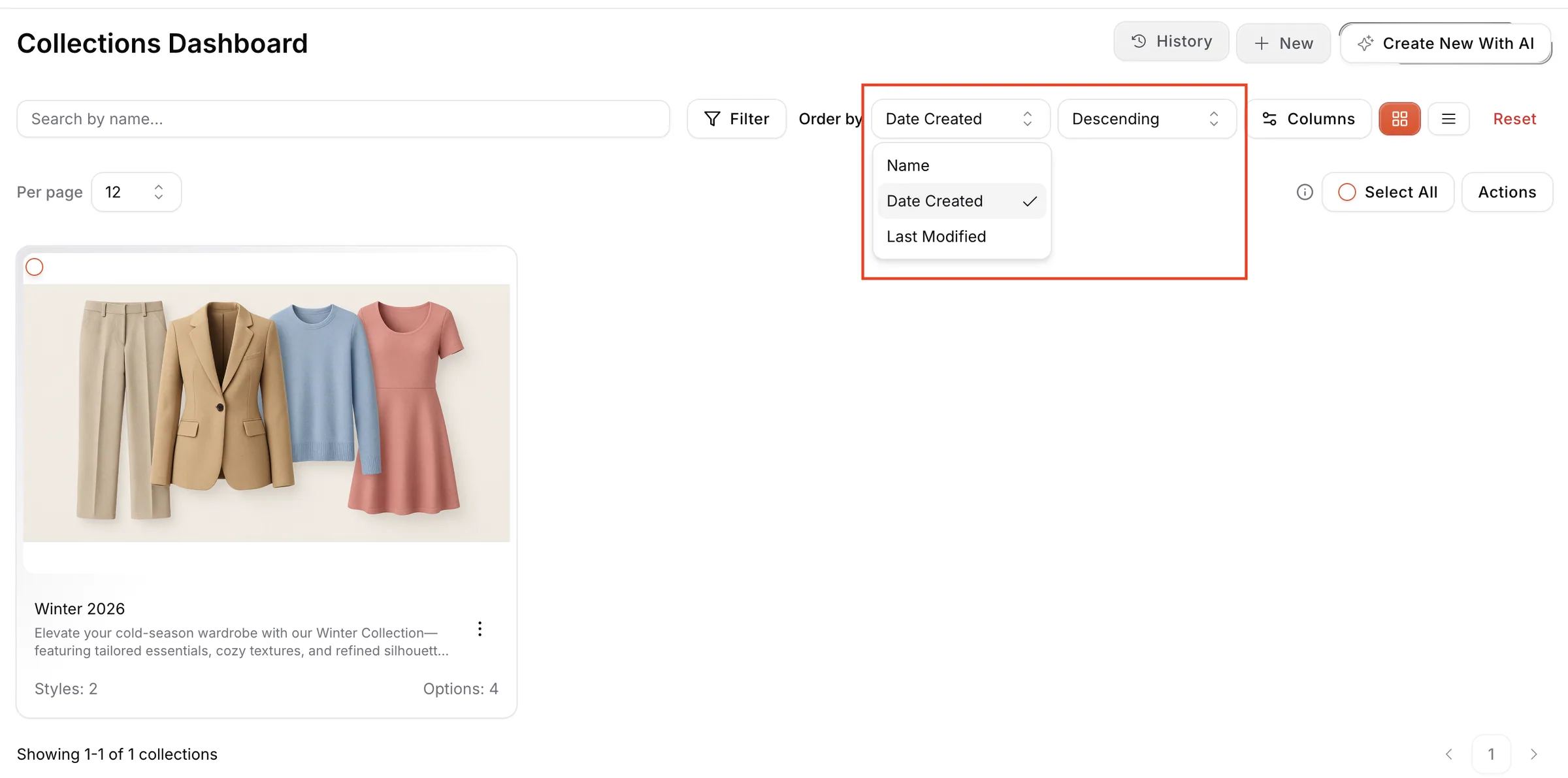
- Find the headline ‘Order by.’
- Select Name, Date Created, or Last Modified from the dropdown menu.
- Choose whether the list should be displayed in descending or ascending order.
- The system will automatically update and display the list according to the selected sorting option.
Clear filter
Clear Filter resets all applied filters and returns the view to the full, unfiltered list. This feature ensures users can easily start a new search without manually removing each filter.
- To view all the data in your list, make sure to clear any applied filters.
- Click on the red 'Reset' to return to the original list view.

Customize dashboard display
Customize Dashboard Display allows users to tailor the widgets, metrics, and sections shown on their dashboard.
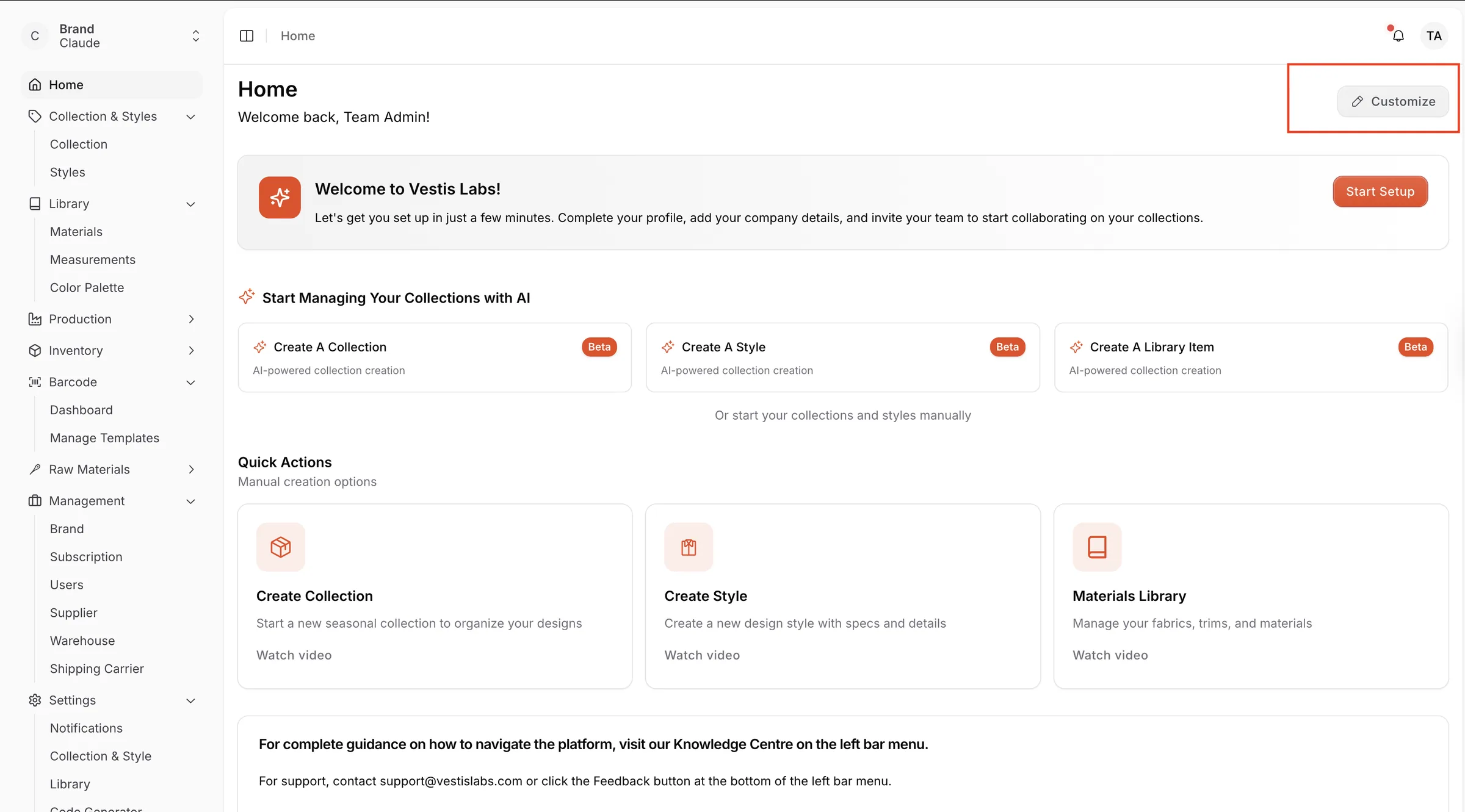
Navigate to the Home page from the left sidebar.
- Select 'Custumize.'
- Enter Edit Mode Click the Add Widget button located in the upper-right corner of the dashboard.
- Choose Widget Type A dropdown menu will appear with the available widget types:
- Text – add custom notes, instructions, or reminders.
- Video – embed a video to guide your team or display training material.
- Add the Widget Click on the widget type you want to add. It will appear on your dashboard, where you can type or configure its content.
- Rearrange or Modify (if needed) After adding the widget, you can position it where you want or adjust its contents.
- Save Your Dashboard Click Save in the top-right corner to apply the changes to your dashboard layout. If you want to revert the changes, click Discard before saving.
Customize column display in collection & style
This feature enables users to choose which columns appear in the Collection and Style lists. By selecting, hiding, or rearranging columns such as status, category, price, or owner, users can optimise the display for their workflow and quickly access the data most important to them.
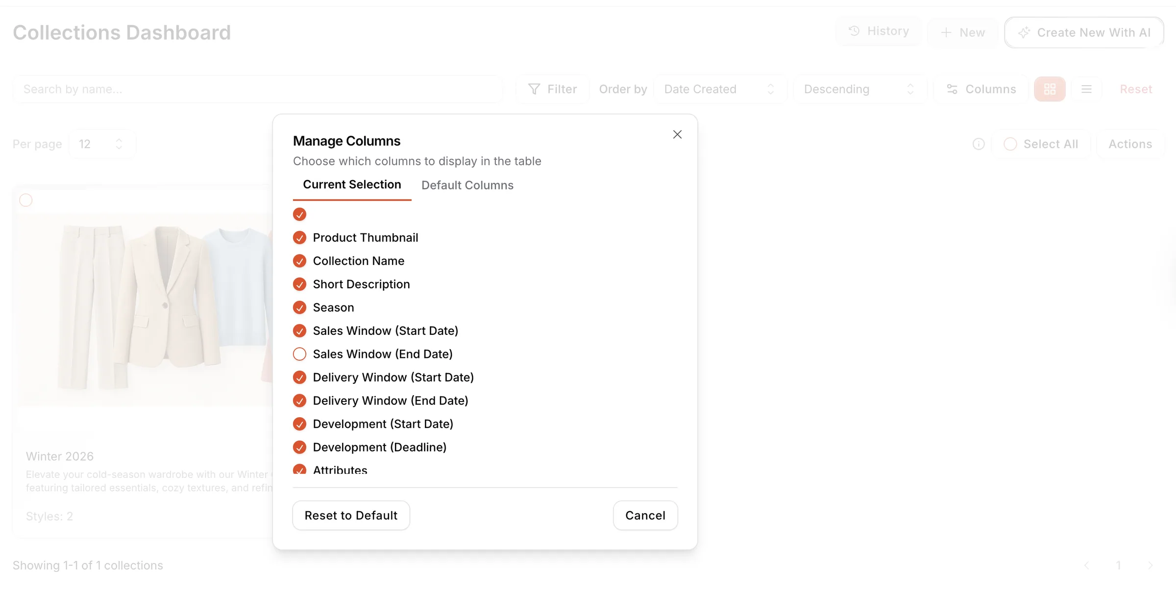
- Open the Columns Menu Click the Columns button in the Collections Dashboard to open the column management window.

- Choose Your Display Mode The window includes two tabs:
- Current Selection – customise which columns you want to see.
- Default Columns – set which columns will be visible by default for new users.
- Select or Deselect Columns
- Check the circle next to each column name to show it in the table.
- Uncheck the circle to hide it from the view. Available fields include Collection Name, Product Thumbnail, Season, Sales Window dates, Delivery Window dates, Development dates, Attributes, and more.
- Reset to Default Click Reset to Default to restore the original default column layout.
- Save or Cancel
- Click Cancel to close the window without saving changes.
- Changes are applied automatically when selections are made.
View toggle icon
The View Toggle Icon lets users switch between Grid View and List View when browsing collections, styles, or library data.
- Grid View provides a visual, card-based layout.
- List View provides a structured, row-based layout.
